5 Best Practices from our Recent Dashboard Project


Effective dashboards should maximize screen space usage, prioritize relevant information, employ appropriate data visualizations, maintain design consistency, and use menus and filters for progressive disclosure. Understanding user needs and personas is vital in designing dashboards that offer a seamless, productive user experience.
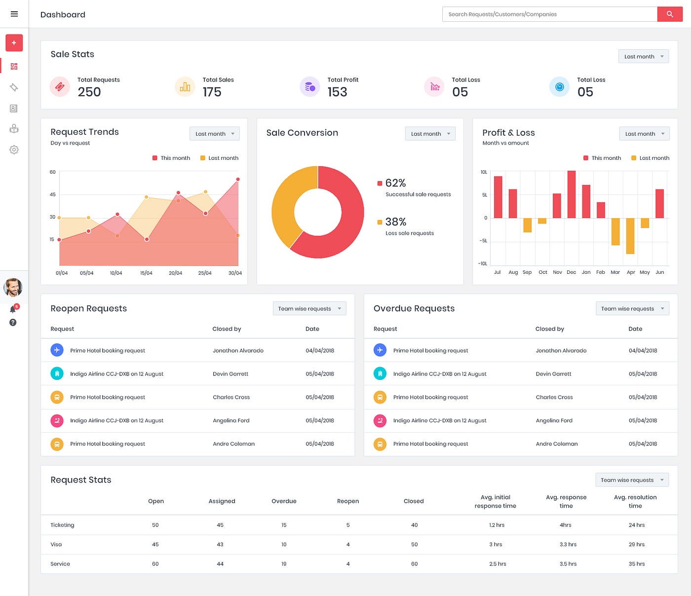
Be it your home or office, things make more sense when they are organised. The same is applicable when it comes to data. This is where dashboards come in handy. Users interact with the dashboard more than any other portion of an application. It’s not just a matter of having visually pleasing charts and graphs organized in tidy boxes to work with, but of the right data sets being presented in a seamless, instantly graspable manner.
A good dashboard design can dramatically impact productivity for all users and create a professional first impression of the product. Though each dashboard design has unique requirements, there are some of common aspects that we learned from our project that can be applied while designing any dashboard.
1. Effective use of Real Estate
According to present viewing behaviors, effective use of horizontal and vertical real estate is vital. It encourages users to see whole content without breaking it up across pages. When it comes to vertical real estate, it is free as long as the content is interesting. Though growing demand for responsive designs has made horizontal real estate understated, fitting your content appropriately to horizontal screen space available can draw more attention to your story and experience as a whole.

2. Provide Relevance at a Glance
Dashboards are meant to show decisive information at a glance. A user should be able to find an information within seconds and this is achieved by displaying only the information that is truly useful to the user. The key factors that need user attention have to be displayed upfront, highlighted and in large fonts so that the user can get alert and make decisions of immediate action if needed.
3. Right Data Visualization
Data visualization can condense a lot of complicated information into a small space and so convey the results. It is necessary to use visualizations that aid the users. We can’t just run some calculations and plop the results into the first chart we find. There are many data visualization methods available but it is important to choose the right one to swiftly answer the questions the user has in mind. For example, pie charts cannot be used to precisely compare data. Similarly, bar charts cannot be used to represent continuous data. A wrong data visualization can often mislead and create misinterpreted outcome.
4. Keep Consistency
The more time users spend on a platform, the stronger their mental model becomes. That is why it is crucial to have a consistent theme, be it color, font, icons or naming. Users should not have to wonder whether different words, situations, or actions mean the same thing. It is optimal to use visualizations, language, icons and design patterns that users are likely to be familiar with so that they find it easier to grasp and follow throughout the platform.
5. Employ Menus and Filters for Progressive Disclosure
Every extra unit of information competes with the relevant units of information and diminishes their relative visibility.Progressive Disclosureis a technique used to maintain a user’s attention by reducing clutter. Employing menus allows users to see relevant information first and to drill-down into the data if they want to find out more. It places a huge amount of functionality behind a single button making the dashboard less cluttered. Using filters enables customization of the dashboard so that the user can focus on relevant subsets of information. Filters allow users to categorize and create a custom view that filters out unwanted information according to the need.

As dashboards are user specific, it is essential that a dashboard designer has good insight into users’ needs and expectations before getting into any of the above mentioned technical aspects. Users may include multiple personas and the challenge remains in sorting out their overlapping and diverging needs. Visit us, AufaitUX to explore more about our Dashboard Project.
Table of Contents
Ready to elevate your product design to the next level?
Hire us to create cutting-edge UX/UI designs that captivate, engage, and convert.
Contact us