23 dashboard UI/UX design principles for delightful dashboards


Effective dashboard design is critical for presenting complex data clearly. Best practices like organized layout and flow, progressive disclosure, thoughtful use of colors, interactivity, etc help create delightful and user-friendly dashboards that empower users to make informed decisions based on data.
Data is a driving factor of businesses. It significantly contributes to business insights and brings innovation to technological landscapes. To leverage the best out of data, it has to be organized and presented in a clear and logical way. Dashboards are effective tools which serve this purpose.
Inspired by the automobile dashboards that let drivers check key information like speed, fuel and distance at a glance, digital dashboards aim to convey relevant information to users in simple format using efficient dashboard design principles.
In this article, we delve into dashboard ux design and look at the key characteristics, components and types of digital dashboards. We also discuss 23 dashboard design guidelines for creating delightful dashboards.
What is a dashboard
The Big Book of Dashboards, one of the most resourceful reads for dashboard design, defines dashboard as:
“A dashboard is a visual display of data used to monitor conditions and/or facilitate understanding.”
Although a broad definition, it conveys the essence of dashboards accurately. The goal of a dashboard is to present information in a clear and direct way, thereby empowering users to achieve their goals quickly.
Often, people find data processing difficult due to the overwhelming amount of information presented to them. Dashboards sift the relevant information and showcase them visually to pave the way for simple and easy understanding of data. By guiding users to understand better, it facilitates better decision making.

Evolution of modern dashboards
The origin of dashboards can be traced back to the 1970s when business dashboards first came into existence to support decision making in businesses. Those were inspired from the automobile dashboards which conveyed information on gasoline levels, speed, engine status and so on to drivers. The first dashboards were solely focused on improving business profits and were unconcerned about design, user-friendliness or regulations.
By the 2000s, advancements in technology paved the way for modern dashboards where factors such as market presence, users, operations and investments began to shape the dashboard designs. Ever since, dashboards have undergone continuous improvements till date. Modern dashboard designs give huge importance to user experience. They are built on the idea that data is best leveraged when it's rightly presented.
What are the key characteristics of information dashboard designs
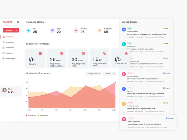
Great dashboards are built on simplicity and are action-oriented. They communicate information in a quick and streamlined way, making them easy to use. For example, look at our dashboard ux design for an enterprise client. It is clearly organized, well-presented and uses multiple data visualization elements to impart information efficiently.

Some key characteristics of good dashboards are:
- Presents complex information in a simple manner
- Provides a clean user interface
- Showcases relevant information in a clear and efficient way
- Ensures visibility of essential KPIs in one glance
- Implements visual hierarchy and data prioritization
- Conveys a clear story and are easily understandable
- Uses data visualization techniques to present data appealingly.
These key characteristics can be universally applied to all dashboards and are the fundamentals for building usable and functional dashboard design UX.
What are the components of a good dashboard
Depending on their purpose, different dashboards prioritize different components. However, there are certain components that must be included in all dashboards for the best experience. These components are essential in enhancing the dashboard UX UI design. They are:
Metrics and KPI: Each dashboard has specific metrics or KPIs that it must track. The users of the dashboard determine what these metrics are and depending on them, the required data is processed and presented.
Data visualization: Dashboards are visual displays. They showcase information through data visualization techniques like charts, graphs and maps. Graphical representation of data improves the usability of dashboards.
Filters: Conditional data analysis is a key goal of dashboard users. Analyzing the data trends for a specific period of time or particular area of operation is often preferred by decision makers to derive meaningful insights. Filters enable this conditional analysis and thus improve the dashboard ux design.
Navigation: Proper navigation is an essential component of dashboard design. It makes dashboards usable, intuitive and accessible. Without a well-defined navigation, users may find it difficult to access desirable data quickly.
What are the different types of information dashboard designs
To meet the different end-user goals, dashboards come in different types. Choosing the right type of dashboard is fundamental to ensure the right results are achieved. Factors such as the type of users, their problems and goals determine the suitable dashboard type for each.
Three prominent types of dashboard designs are– operational, analytical and strategic. All of these are information dashboard designs, used to analyze and monitor various data that contributes to the growth of organizations.
Operational dashboards display time relevant information to help users take appropriate actions. They are frequently updated, and provide the current status to users at all times. Operational dashboards are used to monitor the real-time performance of key metrics and KPIs.
Google Analytics real-time dashboard is an excellent example of operational dashboards. They are used to manage the intra-daily performance of organizations. Typically, business users and managers use operational dashboards. The goals are to track performance against targets and to improve employee awareness.
Analytical dashboard design
Analytical dashboards work on large volumes of data to discover insights, trends and predict outcomes. These dashboards display data on a historical basis, comparing it against previous performances and are not frequently updated.
Often used by business or data analysts, the goal of analytical dashboards is to provide visibility into critical processes and improve performance issues. They help organizations establish targets by identifying deeper insights and investigating recent trends.
Strategic dashboard design
Strategic dashboards are used to aid the long term strategy of companies by helping them track performances against a set of KPIs. By tracking KPIs and creating action plans and strategies, they focus on making an enterprise-wide impact. Strategic dashboards undergo data updates on a recurring basis, but not as frequently as operational dashboards.
They are mostly used by senior-level management, such as executives and directors, to help them stay on top of KPIs through simple data visualizations. They aim to solve top line organizational KPI issues through monthly, quarterly, or yearly performance reviews.
Top 23 dashboard UX design principles for successful dashboards
Dashboards help to leverage data and improve the performance of organizations. Well-designed dashboards are easy and intuitive to operate and use. They are user-friendly and action oriented, making data analysis and decision making easy. Let’s take a look at 23 modern dashboard UX design principles to create delightful dashboards.
1. Understand the users
All dashboard designs should be guided by the question “Who are the users and what do they want?”. Once the user needs are identified, information related to it such as the required metrics, suitable type of visualization and so on are gathered. All of these determine the style of the dashboard.
For example, dashboard UX design for an ecommerce admin will be very different from that of an insurance customer. To understand the users and their needs, the best way is to implement UX research methods. Research will help the development of user personas, which are fictional characters resembling the target users. Based on the personas, the dashboard is ideated.
2. Define the purpose
As important as identifying the users is knowing their purpose behind using the dashboard. The purpose decides which type of dashboard should be designed to best serve the users. It is essential to identify this right in the beginning as otherwise, it may hinder the decision making in the later stages.
3. Keep it simple
Today, designers have access to several tools with which they can create stunning visuals. Creating elaborate designs doesn’t take hours of effort as during earlier times. Although it is a significant advancement, for modern dashboard designs, it is ideal to use extra refinements sparingly. Simplicity should be the priority and it will guarantee long-lasting results given how it is a UI UX design trend that will remain evergreen.
Some key points to maintain simplicity are:
- Use pictures only where necessary
- Do not overdo shadows and textures
- Use precise and legible labels.
The end result should be a simple dashboard with the relevant visuals and key points clearly highlighted.
Take a look at this simple dashboard design we created for KSEB with clear labels and minimal outlook.

A dashboard is essentially a visual display. Hence, data visualization elements like charts and graphs serve a core purpose rather than being merely ornamental. Choosing the suitable visualization tool for any information dashboard design requires some analysis. While the right technique can simplify data consumption, the wrong one may leave users confused.
Some commonly used data visualization techniques include:
Line charts:. Typically used type to display comparison over a period of time. They are clear, compact, and easy to analyze.
Bar charts: Used when multiple data in the same category needs to be compared, for example, the number of visitors by country.
Pie charts: Used to indicate composition, pie charts are common but not very precise. Although it facilitates instant scanning, users may have difficulty in comparing slices of smaller sizes.
Scatterplots: Indicates relationship and distribution. However, they are not easy to decipher and are preferred only for a knowledgeable audience.
Bubble charts: Used to indicate relationships, they lack precision and clarity and are not commonly used in dashboards.
Sparklines: Sparklines are great for visualizing trends involving a lot of metrics. They are compact and easy. However, they can’t indicate individual values as they don’t have a scale.
Tables: Tables are used for comparison of multiple items and displaying data-rich content.
Here is a merchant dashboard design we did, where we used different data visualization elements to convey information clearly.

5. Follow the five-second rule
The five-second rule states that a user trying to find information from a dashboard should be able to get it within 5 seconds. If the user has to spend more time trying to gather the required information, it means the dashboard is not efficient enough. All the relevant information and the most urgent queries of users should be answered within 5 seconds, that is, at first glance.
6. Define layout and flow
Since dashboards are rich in information, creating a basic skeleton for the composition is essential for good user experience. To bring alignment and consistency, grids can be used to define the layout.
Apart from this, a continuous flow needs to be created to assist users in easy scanning of dashboards. Usually, users start reading from the top left corner of a screen and move down from row to row. However, if there are links between different groups, this flow may not be observed. The designers must understand the context of the dashboard and define the layout and flow accordingly.
This customer dashboard we designed for an insurance company was challenging due to the large amount of data we had to display in a single view. By creating a proper layout and maintaining a flow, we were able to achieve a successful result.

7. Use the inverted pyramid structure
Information hierarchy is crucial for dashboards. The inverted pyramid is a concept used to implement information heirarchy. It involves dividing content into three parts in descending order of importance. That is, the most significant details are displayed at the top, followed by an overview (less significant) and all the background information (least significant) comes at the bottom.
When translating this to dashboard UX design, In a dashboard design, the insights come at top, the trends which help users understand the insights are at the middle and the granular details comes last. This helps catch user attention, satisfy their needs immediately, and make it easy for them to grasp information.
8. Implement card UI design
Cards are the building blocks of modern dashboard design. They are responsive, minimal, easy to arrange and flexible. Each card can be used to represent an idea and can act as a content container. It also brings consistency to the dashboard designs, making it easy for users to navigate. Cards also support design scalability, which makes it an ideal dashboard design principle to follow.
9. Lead with data
Data rules dashboards. They communicate through numbers. So it's important to present data realistically and clearly, without any embellishments. Showcasing numbers straightforwardly helps users identify relevant information in a few and simple steps. It saves users time and fulfills the core purpose of a dashboard.
See how this CRM dashboard we designed for travel agencies leads with data!
10. Choose relevant metrics
The metrics to be displayed in the dashboard has to be carefully done as it will affect the effectiveness of the dashboard. Choosing the right metrics is governed by questions such as who is the target audience and what they want to know. Since information dashboard designs have large volumes of data, to avoid cognitive overload, build a decluttered layout and improve understability, it is important to choose the appropriate metrics for display.
11. Split information wisely
When designing a dashboard, resist trying to display all information on the same page. Splitting information into different blocks or even separate dashboards will improve the ease of data consumption. This is one of the golden guidelines of dashboard design. Information overload hinders usability and makes it hard to find desired data quickly.
Suppose you want to design a dashboard that caters to users of different divisions, say marketing, analytics, and HR. Instead of filling up all the information on the same page, you can use tabs to split the information or group them into distinct and legible blocks. This makes it easy for every end-user to find the data they need easily.
12. Organize visual content
UX psychological principles show that the human brain can process around nine images at one time. This is a critical principle to remember during dashboard UX design. When organizing visual content, ensure that only 7-8 images are shown at a time. Showing more than that will make it look cluttered to users and fail to remain memorable.
13. Always give context
Without context, any information is incomprehensible to the users. The users may not be able to identify what a visual is conveying and what may be the best actions to take next if they are not given context. By giving context, users are given a solid ground on which they can build their understanding. This is one of the most practical dashboard design principles to be followed.
It is a best information dashboard design practice to always give context, even for evident things. Name all visualization elements, give proper titles, mark the axes in graphs and charts, and provide comparison values. This brings a certain standard to dashboard design and increases its usability.
14. Maintain consistency
A consistent dashboard design subconsciously guides the users and enables them to take actions naturally. Consistency in labeling, formatting, and structuring helps users achieve their goals quickly. Inconsistent designs, on the other hand, confuses users and hinders a smooth dashboard user experience.
15. Round the numbers
Numbers are major elements of any dashboards. While it's possible to display numbers in the most precise or decimal format, rounding numbers to full digits is preferred. Presenting conversion rates to 5 decimal places or revenue to the nearest cents may sound more appealing, but according to dashboard design best practices, it is ideal to round the numbers. Moreover, it is easier to remember rounded numbers than decimal digits.
16. Use progressive disclosure
Progressive disclosure is an excellent dashboard design guideline to follow for reducing clutter and saving users time and errors. It revolves around prioritizing the features to be presented to the users. Important information is presented upfront and rarely used features are moved to a secondary screen. This improves efficiency and increases user attention.
17. Thoughtful use of colours
An important dashboard UI design principle is the minimal use of colors. It is best to keep the number of colors to a minimum, say two or three. Once certain colors are picked, they must be followed throughout the dashboard design. The colors can reflect the organization’s brand identity or an app theme. The important thing to keep in mind is they must be relatable and consistent.
Take a look at this dashboard we designed, where we used a simple and consistent colour scheme.

Playing with shades of the selected colours to bring attention to certain elements of the dashboard is often practiced. Saturated colours are used sparingly as it is found to affect the user experience adversely. Using a single color for similar items throughout the dashboard design is a good UI UX design practice.
18. Add interactive elements
Interactive elements add an extra layer of usability to the dashboard design. It allows users to explore certain trends or insights in depth. Integration of elements like click to filter, time interval and drill down makes a dashboard all-inclusive and is a useful dashboard UI UX design principle.
Click to filter enables users to filter values throughout a dashboard according to chosen filter criteria; for example, filtering data specific to a country. Drill-down, as its name suggests, lets a user drill deep down into certain elements or metrics of a dashboard. The time interval widget lets users view data over time, such as days, weeks, or months.
19. Use white space
One of the most important web design trends, white space, is also a crucial design guideline for dashboards. Since dashboards present a massive amount of data, the role of empty space in bringing balance and clarity in design is essential. Ideally, the margin space for the main elements are doubled and white space is provided between different sections or elements to make it easier to understand information.
20. Design for multiple devices
With the increase in the usage of handheld devices and changing work culture, users may not always access dashboards on desktops in an office setup. Therefore, it is essential to optimize information dashboard designs for multiple devices. Optimizing for multiple devices requires integrating intensive testing in the UX design process. The layout, placement, accessibility – everything should be checked and ensured for different screen sizes.
21. Take care of common mistakes
Data visualization has advanced so much today but its important to remember that the value lies in data. Creating visuals just for the sake of it is commonly seen in modern dashboard designs but is not a recommended practice. Use visuals where it can enhance the information understanding by helping to present data in a clear and accurate way. Avoid common mistakes like:
- Selecting an unsuitable data visualization technique
- Using too much real-time data. Unless you are monitoring some real-time trend, the dashboard doesn’t need frequent updates.
- Confusions in calculations, like the percentages of pie charts or slices not adding up to 100.
These general mistakes can be avoided with little care and by not getting sidetracked with visual design alone.
22. Personalization and customization
Personalization and customization are effective dashboard design methodologies that help to increase user engagement. Personalization is done by the system, while customization is done by the user. In personalization, a system can identify the users and provide them with relevant content. In customization, the user can make changes to the dashboard to create an experience suitable for them.
Both options give users a feeling of acknowledgement and value. Giving users more control in their hands facilitates a positive response from them and encourages them to use dashboards.
23. Keep evolving the dashboard
The success of all things depends on their ability to evolve over time by integrating the necessary changes. What works today might not be enough tomorrow. So it’s crucial to observe the changes, take constant feedback and improve the information dashboard design. Changes may be needed in the layouts or KPIs, and some functionalities might need to be altered. Take inputs from the users and keep evolving dashboards to provide the best outcome continuously – that is the most evergreen dashboard design principle!
How Aufait UX can help you design effective dashboards
Aufait UX is a leading UI UX design agency in India, with a solid client base spread globally. We are proud of our expertise in the design domain and have consistently built our reputation with a good share of happy and satisfied clients. Dashboard design is one of our fortes and we enjoy building modern dashboard designs with excellent user experience.
We have worked on several dashboard projects and have hands-on knowledge and experience implementing the best dashboard design principles. Having designed different types of dashboards for dozens of clients across industries, we know what it takes to make a dashboard design effective.
If you are looking for a reliable UI UX design team to work on a dashboard design project, we make the perfect choice. We have extensive experience in implementing dashboard designs, and our insights can really help you. Take a look at our works in Dribbble or contact us right away. Let’s discuss your idea!
FAQ
- 1. What is the fundamental challenge of dashboard design?
The fundamental challenge of modern dashboard design is representing necessary information effectively. Today, as there are many sources to gather information, the amount of data in our hands is massive. Identifying which data needs to be presented and how to do it in the best way is a basic dashboard design principle.
- 2. What are the desirable qualities of an enterprise dashboard?
Complexity is a characteristic of enterprise dashboards. Key qualities of a successful enterprise dashboard are – simplicity, consistency, security and clarity.
- 3. What should a dashboard contain?
The components of a dashboard are determined by its purpose and type. The elements to be included in a dashboard depends on the particular user needs and expectations.
Table of Contents
Are your app dashboards complicated?
Transform your dashboards with simple, yet powerful data visualization.
Click Here

