Building Trust Through Microinteractions: Insights for Designers


Ever felt drawn to an app's satisfying 'ping' or a website's interactive buttons? Those tiny surprises? They are microinteractions that turn ordinary clicks into great experiences.
Microinteractions - subtle motions that evoke emotions!
Isn't it fascinating that tiny interactions can influence human emotions? And to no small extent!
A frustrated user can be calmed down in a minute, someone who is mindlessly scrolling can be driven to express their emotion – all credits to micro interactions.
They are a great example of how small actions can make user experience more enjoyable.
What if I tell you that we encounter microinteractions daily without realizing it?
- The scroll bar that appears when you use a mouse to scroll
- Swiping left to clear notifications on an iPhone home screen
- Seeing someone 'typing' in messaging apps
- A progress bar showing download percentage
- Pulling to refresh the content on an app screen
- Fun error pages like the dinosaur game on Google Chrome and
- Sharing this article by clicking the Facebook logo seen on the upper right side of the screen.
All these are common microinteractions we use everyday!
So, what exactly are microinteractions? How can we use them to connect better with users? Let's answer that!
What are microinteractions?
Dan Saffer in his book, Microinteractions: Designing with Details defines microinteractions as, “A contained product moment that revolves around a single use case or task- a tiny piece of
functionality that only does one thing”.
He uses the example “setting an alarm” or “liking a post” as the most common example of microinteractions.
He explains microinteractions as a sum of four parts - Trigger, Rules, Feedback, Loops & Modes and this is the foundation of the UI/UX design process involving the creation of an engaging microinteraction.

Take the example e-commerce journey of a user in an online shopping app to understand it in detail.
- Trigger: Adding an item to an online shopping cart initiates the microinteraction. For instance, clicking the "Add to Cart" button beside a product.
- Rules: The rules determine what happens next. Once the item is added, the cart icon typically displays a numerical indicator indicating the number of items added, updating in real-time.
- Feedback: The feedback stage confirms the action taken. A notification or a brief animation might appear acknowledging the addition of the item to the cart, providing reassurance to the user.
- Loops and Modes: In this case, loops may involve the user adding multiple items, each triggering the same process, while modes control additional actions like 'View Cart' or 'Checkout' options, offering different functionalities without repetition.
Some popular uses of microinteractions
Now, as you get what microinteractions really are, let us take a look at some microinteractions we come across daily.
- Scrolling
Do you know that when you scroll down a web page, you are triggering a microinteraction?
It is a frequent and easily overlooked action online. When you scroll, you are shifting your position on the page and receiving visual updates as you move – essentially, revealing what you want to see. Some pages provide progress indicators, like a scroll bar on the right side, showing your position or how much content remains before reaching the end.
- Loading
Loading is unavoidable in any product, but as designers we have the power to decide whether it will be an annoying experience or not.
Microinteractions ease the user experience by informing users that their action was recognized and the system is processing it. The acknowledgement calms the users.
Some products take it a step ahead by making the waiting time productive. Slack, for instance, gives you the option to customize your workspace while you wait for things to finish.

- Downloading
Downloading is yet another point in a product journey which could be frustrating for the users if not properly handled. The waiting period associated with downloads is a major pain point to address.
Microinteractions help by updating users with the current system status. When a progress bar or animation appears, showing how much has been downloaded and how much is left, users feel pacified.

Consider a file-sharing platform like WeTransfer. When you initiate a download of a file shared with you, the platform displays a download progress bar. As the download proceeds, the progress bar fills up, indicating the percentage of the file that has been downloaded. This micro interaction keeps you informed, letting you know that your download is in progress and how long it might take. It is a small but helpful way for users to track and understand the downloading process.
- Notifications
According to the New York Post, people check their phones every 12 minutes, which is around 80 times a day. And what are they looking for?
Notifications!

Microinteractions add excitement and enhance the visibility of notifications for users. A subtle movement, as shown here, grabs more attention compared to a static icon.
- Button hover
You might have seen on Facebook, when you hover over the like button, various animated emoticons appear for you to select from. Social networks focus on user engagement, and microinteractions, such as this one, encourage users to interact with posts in diverse ways. And these days, UX for Startups is leveraging these simple engaging methods to draw in more users.

Best practices for creating impactful microinteractions
Even though small, microinteractions can have a huge impact on your user experience, evolving your product into an engaging and outstanding one.
So, how can we create microinteractions to delight users? Let us check it out.
- 1. Be purposeful and design intentionally
Any UX-related work requires a deep understanding of the user. Before designing microinteractions, consider:
- What does your user require?
- Will this microinteraction meet that requirement?
- Does this add value to the overall user experience of your product?
- 2. Provide quick feedback
To prevent user confusion and frustration, UX design services focus on providing instant feedback right after triggering a microinteraction. It is important to avoid implementing microinteractions that impact your product's functionality, as ensuring functionality should always take precedence.

Take a look at Google Chrome. It gives high-speed feedback to the user by flooding the search bar with auto-suggestions when they just start typing.
- 3. Practice minimalism
Do not overwhelm the users with too many options to establish an interaction. At the end of the day, the user is going to perform only one action at a time. So, remove unwanted design elements and make the microinteractions as simple as possible. Simple microinteractions can make the users happy which in turn can result in increased engagement.
Take a look at Brenden Fletcher’s “ Add to Cart” button design. It is serious, but simple and fun!

- 4. Ensure consistency by designing on the lines of the user’s mental model
When designing a microinteraction, it should follow the user's thought process. The user should easily anticipate what to do next without any hassle.
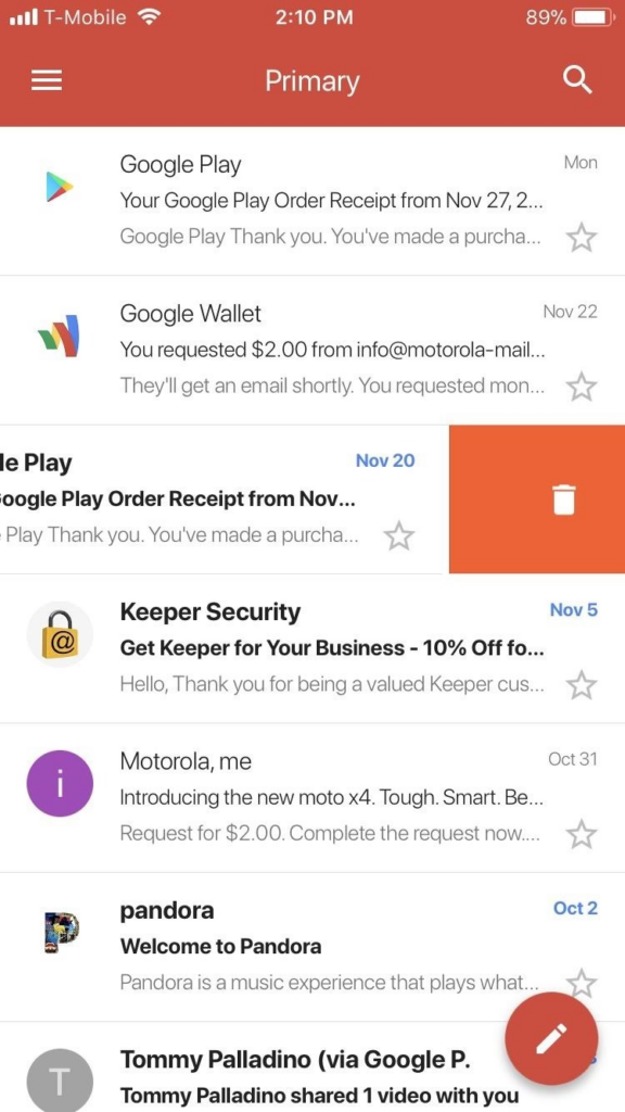
Swiping left on Gmail moves the email to trash. This microinteraction is executed instinctively by the user.
- 5. Don’t attempt to reinvent the wheel
Think about a music app where users are accustomed to tapping on a song to play it. If suddenly, tapping a song title resulted in it being added to a playlist instead of playing it, users might find it unexpected and confusing. That is because they are used to tapping to play the song.
By maintaining familiar interactions like tapping to play while introducing innovative features, designers can strike a balance between tradition and innovation, ensuring a smoother user experience.
Microinteractions are really macro
In UX design, small things can have a big impact.
Microinteractions may last only seconds, but their influence on user experience is significant.
A well-executed animation or sound can engage users, while a poorly designed one can turn them away. Moreover, these small instances can also hold marketing value.
However, despite their brevity, handling them can be challenging.
It is crucial to ensure that UI/UX design agencies strike a balance between functionality and relevance. The UI/UX designer's deliberate approach is key to using the digital world's most powerful tool to engage users.


