3 Must-Dos for Every UX Project’s Success


The success of every UX project hinges on three key phases: Empathize, Visualize, and Design. Empathizing with stakeholders and users, visualizing the project's path, and meticulously designing the interface lead to user-centric, efficient designs that enhance the overall user experience.
The concept of user experience (UX) is as simple as it sounds — make the product usable and friendly. And when it comes to the digital interface, the concept remains just the same. Not the effort though. Many of us stumble upon the UX part while getting all functionalities right. To make a digital interface usable, there are many aspects to keep in mind and the UX process that one adapts is completely dependent on the size and complexity of the project.
Back when we were a startup UX design agency, we had trouble deciding the process for each and every project. Gradually, working on more and more projects we realized that whatever the project be, there are mandatory phases in UX design. And those must-dos are Empathise, Visualise and then, Design.
Empathise
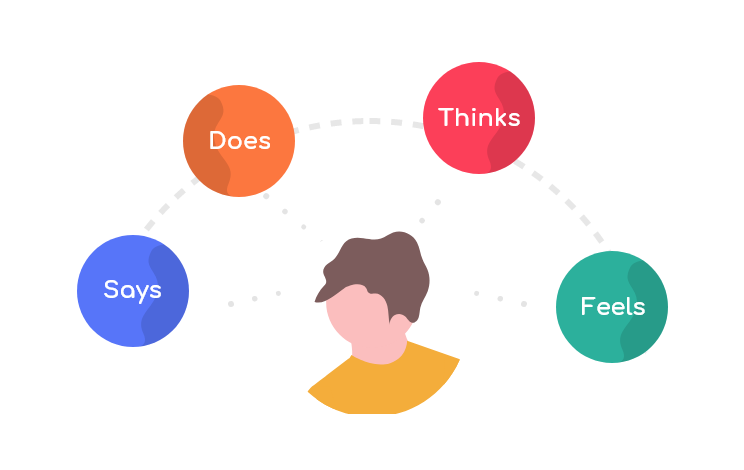
Empathy is of foremost value when it comes to UX design. Gone are days when users will use anything that is functional. Digital interfaces have been around for a while now and so is the experience relating to it. Users expect a smooth experience and they don’t return when they don’t get it. Also, every product has an alternative nowadays and if the alternative offers a better experience, then it is very unlikely for the user to return *wondering if there exists a product that does not has a competitor*. So whenever our team starts a new project, what we start with is empathise. Empathise with the stakeholders, empathise with the product’s user and if possible, empathise with competitor’s users also (it might help you stay one step ahead if you find those user’s pain points). The most used approach to empathise with users is to do user research and with the data retrieved, create user personas. These personas help you to identify the issues and address each of them while designing the interface.
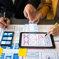
Visualise
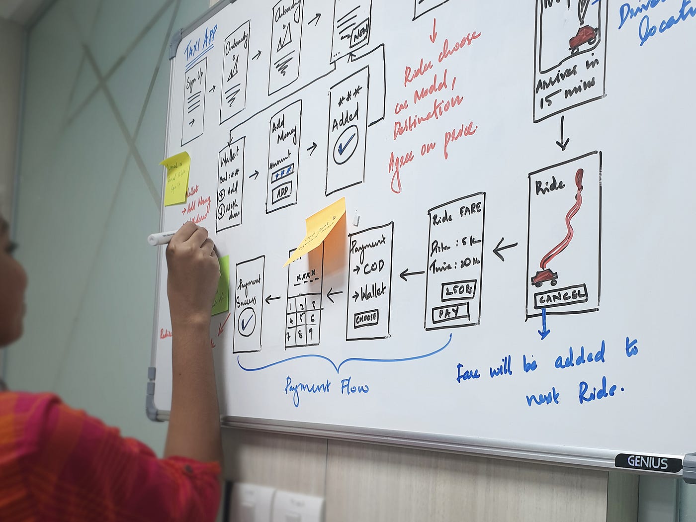
This is the phase where you yourself make clear the plan ahead and also let the stakeholders pitch in. Here we let the ideas in our heads into material things like sitemap, journey maps and wireframes and double-check on each aspect within the team and with the stakeholders. This makes sure that our ideas can be practical and also bridge the gap between our understandings and stakeholder’s expectations. Visualising helps in defining information architecture, navigations and even predict user behaviour through analysing user flows. A clear visualisation breaks all wrong perceptions and helps minimize iterations in the later phase. The level of clarity that visualisations can bring in the early stage of a project can avoid situations in the later phase where you end up doubting your decisions.
Design
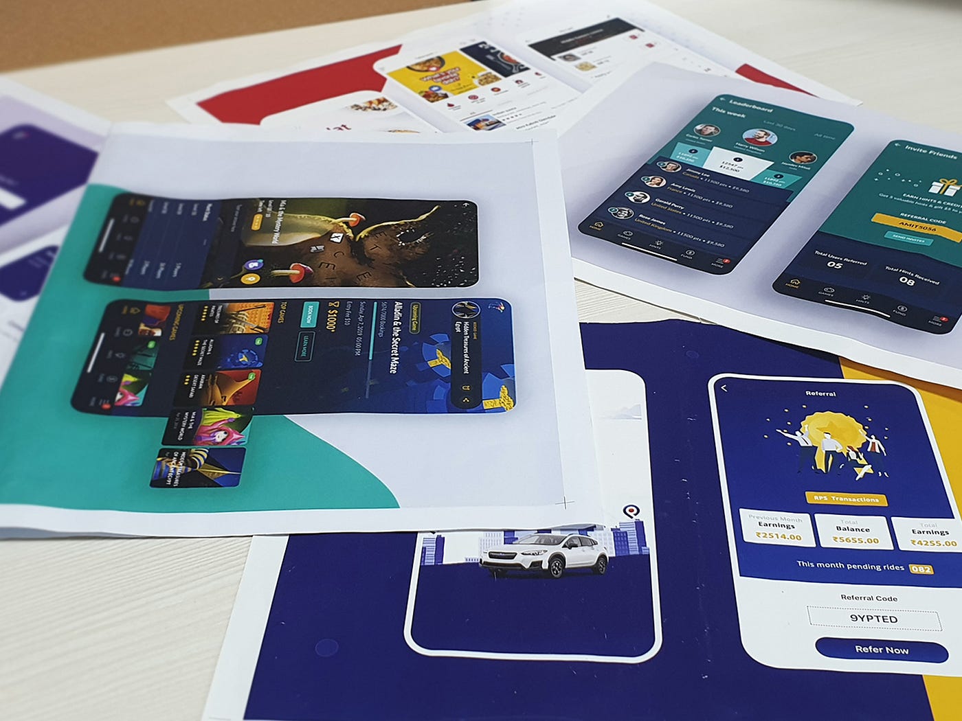
This is the last phase where we work on the actual design of the product. And this phase ain’t easy either as this phase has the responsibility of visually pleasing the users. Bringing in the colours that relate to the users emotionally yet not confusing on the purpose of the product is one of the tedious tasks in this phase. Moodboards are a cool way to pre-plan on what colours you want to bring in to a product. Choosing the right font that is readable and legible also plays a major role. A right font and font sizes can make the product look clean and makes sure the copies communicate to the users besides filling up space. Once the mock-up is designed, we mostly choose to prototype as including prototyping in UX design ensures no flaws in user flows. It also gives the stakeholders an idea of what the product will look and feel like. Prototypes have also helped us for user testing the product before actual development to find out pain points if there are any.
No matter how cool an interface looks or how functional a product is, it is very usual that users get impatient when they find a minor inconvenience. So as a UX design agency, we always prioritize to deliver a design that efficiently empathizes with the user in every possible scenario. Empathising through UX copies has also proven to elevate the user experience of our product on a large scale. A small error message presented in the right tone can make the user feel pleasant and try again rather than leaving the app. Undoubtedly, Empathising has been the best strategy for us to thrive as a UX design agency and has been a sure shot success in all our projects.
Table of Contents
Ready to elevate your product design to the next level?
Hire us to create cutting-edge UX/UI designs that captivate, engage, and convert.
Contact us