Understanding color theory: Role of colors in UI UX design


Color theory is fundamental in UI/UX design, influencing user perceptions and emotions. By mastering the principles of color theory, designers can create visually engaging and meaningful designs that resonate with users and effectively convey a brand's message.
From the vibrant hues of the rainbow to the calming shades of the serene ocean, color has the power to evoke emotions. In UI UX design, colors set the tone and elicit strong feelings in users. Research reveals that users make a subconscious judgment of a product within 90 seconds of initial viewing and 62%-90% of the assessment is based on the color alone. This proves the pivotal role of colors in the design and their impact on visual communication.
Choosing the right colors for a UI/UX design requires an understanding of the formation of colors and how they interact with each other. Color theory, whose roots date back to the 1600s, is used to create visually appealing designs that stand out. This article explores the color theory and how colors can enhance the visual appeal and visual communication of designs.
What is color theory?
Color theory is a set of rules and guidelines used by designers to create appealing visual interfaces. As the first interaction of the users with a product is visual, UI designers choose color as the main language for the initial communication. Visually attractive colors that impact users aesthetically and psychologically play a significant role in capturing user attention and imagination.
Color theory is the framework that informs designers about the use of colors in the design. It is the art of combining colors using the color wheel, wherein the best colors that convey the desired message are picked to make visually attractive interfaces. Different colors have different meanings, for instance, red is associated with power while blue evokes a feeling of trust, and green is used in relation to nature. Each of these colors may also have multiple meanings.
A firm grasp of color theory is essential to crafting harmonious, meaningful designs for users.
Understanding colors
Human eyes can see more than 10 million colors and can effortlessly notice harmony and contrast in nature. When creating UI UX designs, designers work extensively to identify the color palettes and different color combinations for each design that would work best for the target users. The foundational knowledge of this stems from learning about the color wheel.
Newton’s color wheel: The Physics of Color Theory
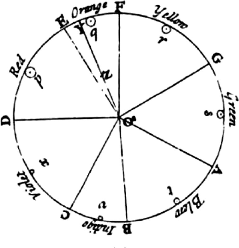
Modern color theory is based on Isaac Newton’s color wheel discovered in 1666. The color wheel is used to accurately combine colors and understand how colors relate to each other. Over the years, the color wheel has gone through many transformations, magnifying the possibilities of new color combinations.
The three basic categories of colors in a color wheel are primary, secondary, and tertiary colors.
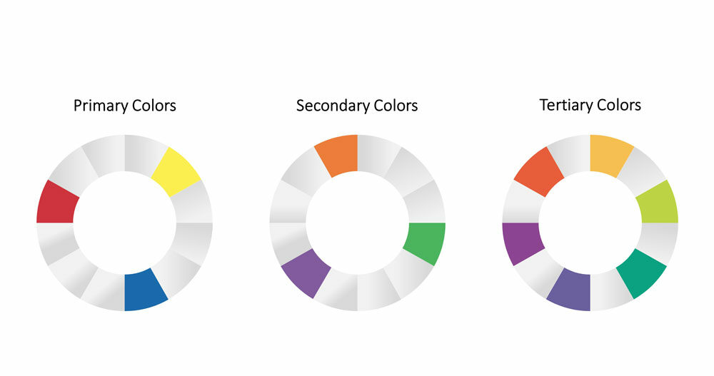
- Primary colors are parent colors and they cannot be created by combining any other colors. Red, blue, and yellow and the three primary colors.
- Secondary colors are formed by combining primary colors and orange, purple, and green make the three secondary colors.
- Tertiary colors are formed when a primary color is mixed with a secondary color. The tertiary colors are magenta, vermilion, violet, teal, amber, and chartreuse.
In digital designs, the RGB (Red, Green, Blue) color model is used to mix colors. A value between 0 and 255 is assigned to the web primary colors, where 0 is dark and 255 is bright. RGB is an additive color system where the colors become lighter after mixing them. For example, when Red, Green, and Blue are mixed, the outcome is white color.
Newton considered colors as human perceptions rather than the qualities of light, like wavelength or frequency. Hence the application of color theory in design helps to create human designs that capture users’ attention.
Color Harmony
While the color theory is important to guide UI designers on how to mix colors appropriately, another aspect, color harmony, also has a significant role. To create a balanced and visually pleasing UI, systematically arranging colors is necessary. This must be done in alignment with the overall aesthetics and brand image.
Color harmony is important in UI designs for several reasons:
- Aesthetics: The UI is more attractive and engaging if there is a balanced composition of colors.
- Branding: Color is a brand’s visual identity and messaging medium. Color harmony helps designers to ensure that the colors used in the UI align with the brand’s message.
- Usability: Color is important to create a consistent visual language throughout the UI. It makes the design intuitive and easier for users to navigate.
- Emotion: Colors can evoke emotions and feelings in users. A balanced composition helps designers to create a specific mood to enhance the user experience.
- Accessibility: Color harmony helps to achieve necessary contrast, improving the accessibility of designs.
The role of color in UX design
Choosing the right color for the design is an effective UX strategy. Because colors help designers influence how users think and behave. It is the primary medium through which designs communicate with the users and build a long-lasting impression. For instance, McDonald’s uses the colors red and yellow in its logo to evoke stimulation and happiness.
In design, colors have several meanings, including
- Emotion: Different colors evoke different emotions in people. While red is associated with passion, blue can evoke calmness.
- Branding: Companies use a specific color to convey their brand message. For example, Coca-Cola uses red in its logo to represent passion.
- Functionality: Colors can also be used to highlight the e functional properties of products. For example, an Enter button would have green color whereas a Cancel button would be in red.
- Cultural significance: Different cultures assign different meanings to colors.
- Aesthetics: Sometimes colors are used simply for aesthetic appeal. For example, UI designers use a specific color because it makes a design beautiful. This is why the latest web design trends give the utmost importance to color.
- Hierarchy: In design, colors are used to indicate importance or hierarchy. A brighter or bolder color for a call-to-action button makes it stand out on a page.
Colors can create a visual hierarchy to guide the user’s attention, evoke certain emotions and create a consistent visual identity for a brand. Having a well-conceived color scheme can elevate a design from “ good “ to “ great” while a mediocre palette may hinder the very user experience.
Color Psychology
“Color is a power that directly influences the soul” - Wassily Kandinsky
The colors used can have a dramatic effect on the user’s perception. This is why UI/UX designers choose colors that suit the brand philosophy and purpose. Famous Tech brands like Dell and Samsung use the blue color in their logo to convey trust and reliability. By using colors strategically in design, certain emotions can be evoked in the users.
Take a look at this picture to know the different colors and their association with emotions.
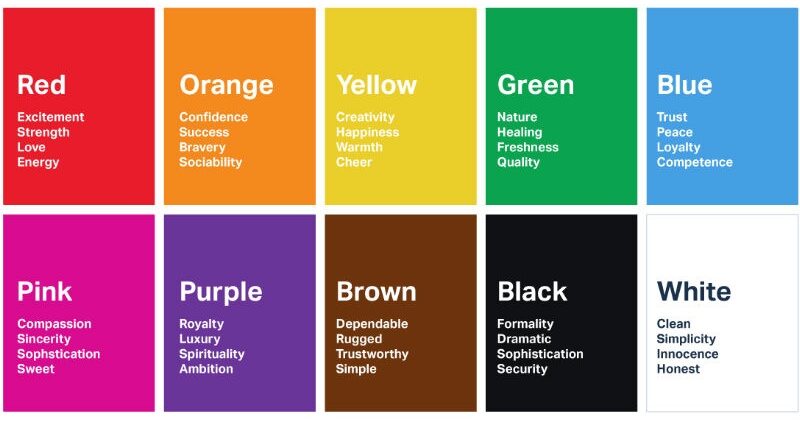
Colors can be used to evoke specific moods and impressions, and to influence the way users interact with a product. Warm colors like red and orange create feelings of energy and excitement while cool colors like blue and green evoke calmness and tranquility. Understanding color psychology helps designers identify which colors work best for each design and thus create more impactful products.
Examples of color psychology in logo design
Brands use colors thoughtfully to reinforce their identity and communicate the brand messages with the users. For instance, Google icons are designed with color psychology in mind to help users quickly identify the purpose of the different products offered by the company. It is interesting to know how each color in the Google icons conveys particular meanings.
- 1. Google

Google’s core product, Search, is one of its main tools. Google uses the colors red, yellow, green, and blue colors on its logo. Red is a catchy and energetic color associated with excitement and naturally captures users’ attention. Yellow evokes happiness and optimism in users, symbolizing a positive approach to the user's need of finding the answer to a query. Green conveys growth and harmony, evoking calmness and a feeling of self-development. And blue is associated with intelligence and trust, conveying that Google provides authentic information.
- 2. YouTube

The number 1 video sharing platform in the world, YouTube uses two main colors in its logo - red and white. Red represents excitement white symbolizes purity and harmony. Together, these two colors convey the brand's personality.
- 3. Amazon

E-commerce giant, Amazon, has an interesting logo – a smiling orange arc between the letters A and Z of “Amazon”. The color orange is used to convey pleasure and enthusiasm and the arc’s path indicates that it offers products from A to Z, meaning products of all ranges.
- 4. McDonald

McDonald’s logo design is a shining example of how color psychology is used to impact users’ emotions. The golden yellowish arch placed on a red background makes use of mood-elevating colors to trigger appetite.
- 5. Walt Disney

The black iconic castle from Cinderella in the logo design of Walt Disney symbolizes immersive storylines and fantasy plots. The graphic elements complement each other and show the magical face of the company.
Cultural differences in color
When dealing with colors, being mindful of cultural differences is essential. Considering cultural differences is necessary when designing products for a global audience to ensure that the intended message is rightly conveyed. For this, ethnographic UX research might help to avoid any potential misunderstandings or culturally insensitive usage of visuals.
Certain colors that have positive connotations in one culture have negative connotations in another. For example, in western nations, white color is associated with innocence and purity whereas in Asian Countries white symbolizes death and mourning.
Summary
Color theory plays a crucial role in UI UX designs and it greatly affects the user’s perception of a product or website. So, an understanding of the basics of the color theory such as color wheel and color harmony lets designers create visually appealing and effective designs. It is also important to focus on accessibility and cultural content while using color in designs. The principles of color theory can be implemented in a thoughtful and intentional way to create designs that not only look great but also communicate the brand message.
FAQ
- 1. What is the importance of color theory in design?
Color theory in design is an important design principle applied by UI UX designers to craft visually appealing designs. A knowledge of color theory in design is essential to make the product stand out from the competition. It helps to effectively communicate with the target audience.
- 2. Is color theory a design principle?
Yes, we can say that color theory is a design principle because color is an important design element. It has countless possibilities to communicate with the users and color theory helps to choose the right color as it is a set of guidelines that have to be followed to combine colors to create a harmonious design.
- 3. What are the 3 qualities of color theory?
Colors are defined by their qualities: Hue, Saturation, and Value.
- Hue is a color or shade or it is a spoke on the color wheel.
- Saturation denotes the intensity of a color/hue. If we say that something is fully saturated, it means that it is the most intense form of a color.
- Value is the most important of the three qualities of color theory. It shows the relative darkness and lightness of a color.
- 4. How does color theory influence customer behavior?
Color has a significant role in making people want to buy certain things. The emotion of the users is intricately linked to the color used in the design. This aspect of color theory in design is harnessed by brands to grab the attention of the user. The rule of thumb is that color speaks to the user at an emotional and psychological level.
Table of Contents
Ready to elevate your product design to the next level?
Hire us to create cutting-edge UX/UI designs that captivate, engage, and convert.
Contact us

